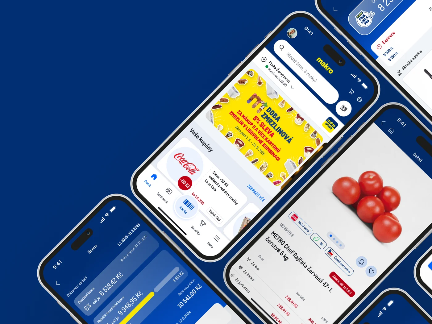
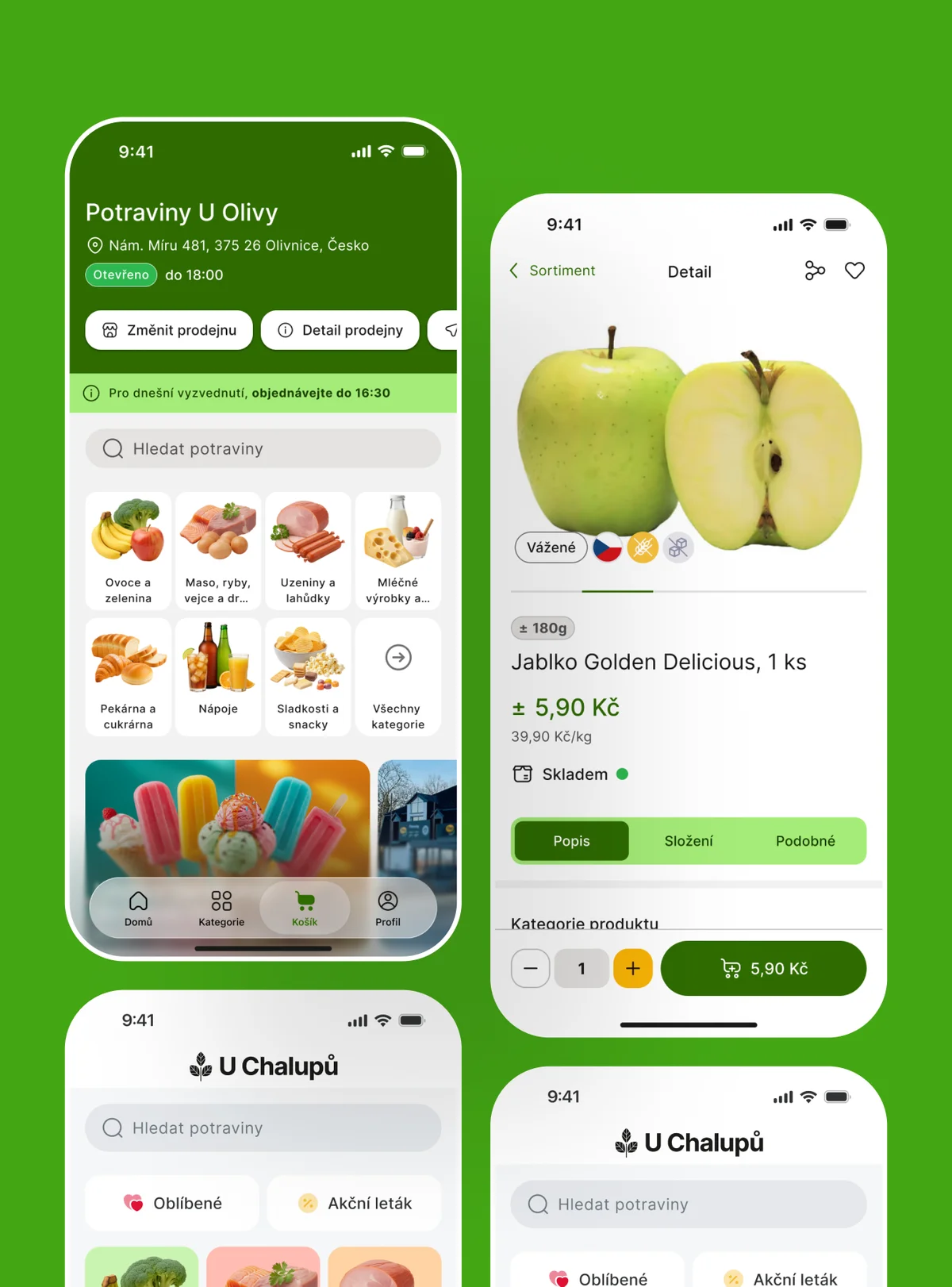
Websites.
A company website is often the very first point of contact between a brand and its customer, so I approach its design as building a key communication and conversion tool. It's not about stacking attractive visuals and copy on top of each other; my goal is a well-thought-out information architecture that guides the visitor smoothly through the brand's story all the way to the desired action. Whether it's selling a service, booking a meeting or conveying expert information, every pixel has to serve its purpose, be technologically responsive and visually resonate with the client's deeper values.
Thoughtful structure and flow for every segment
The diversity of projects I've been through taught me there is no single universal template for a successful website. A sales-driven e-commerce platform aimed at the tight-knit gaming community on Rcore.cz demands a completely different dynamic and structure, while presentations of modern projects like Chatky na kolech or the local light-therapy studio Projasni.cz need an entirely different, soothing approach. That's why I always start with a deep understanding of the target group and its mental model, so I can design navigation and content layout that feel completely natural to users in that context.
A special category is websites with a strong educational or informational character, where the main goal is maximum clarity of complex data. A typical example is the Edustories project for Masaryk University, designed in the style of an extensive yet clear wiki platform mapping case studies of student behavior. Precise work with typography, white space and visual hierarchy is absolutely crucial there, so that even the most complex textual content remains easy to consume and holds attention.
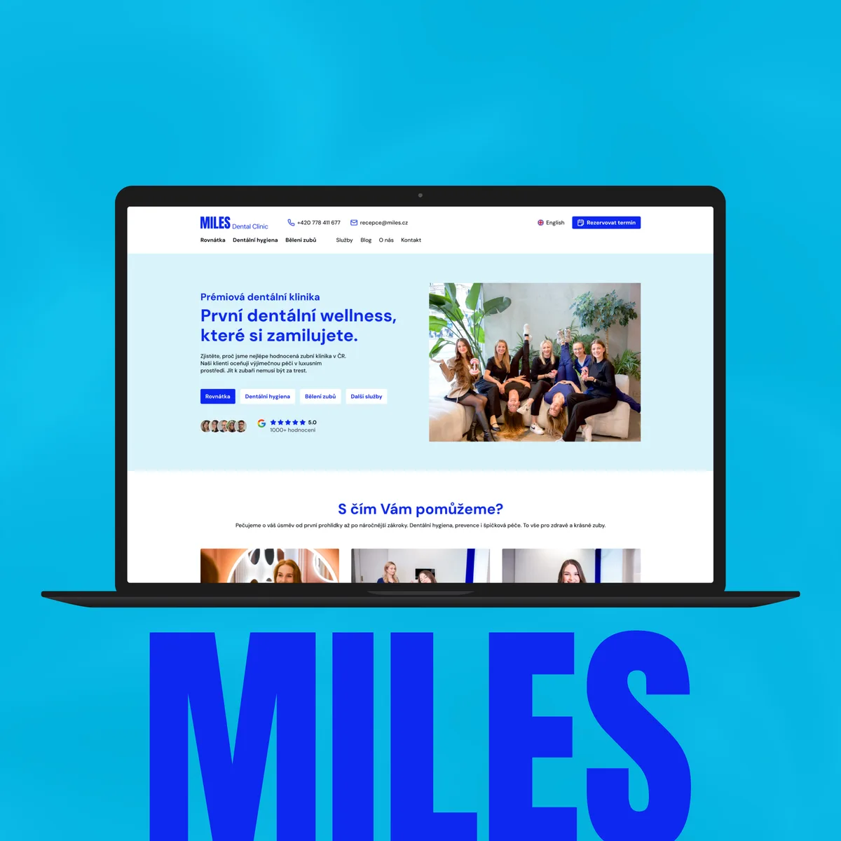
Miles dental clinic
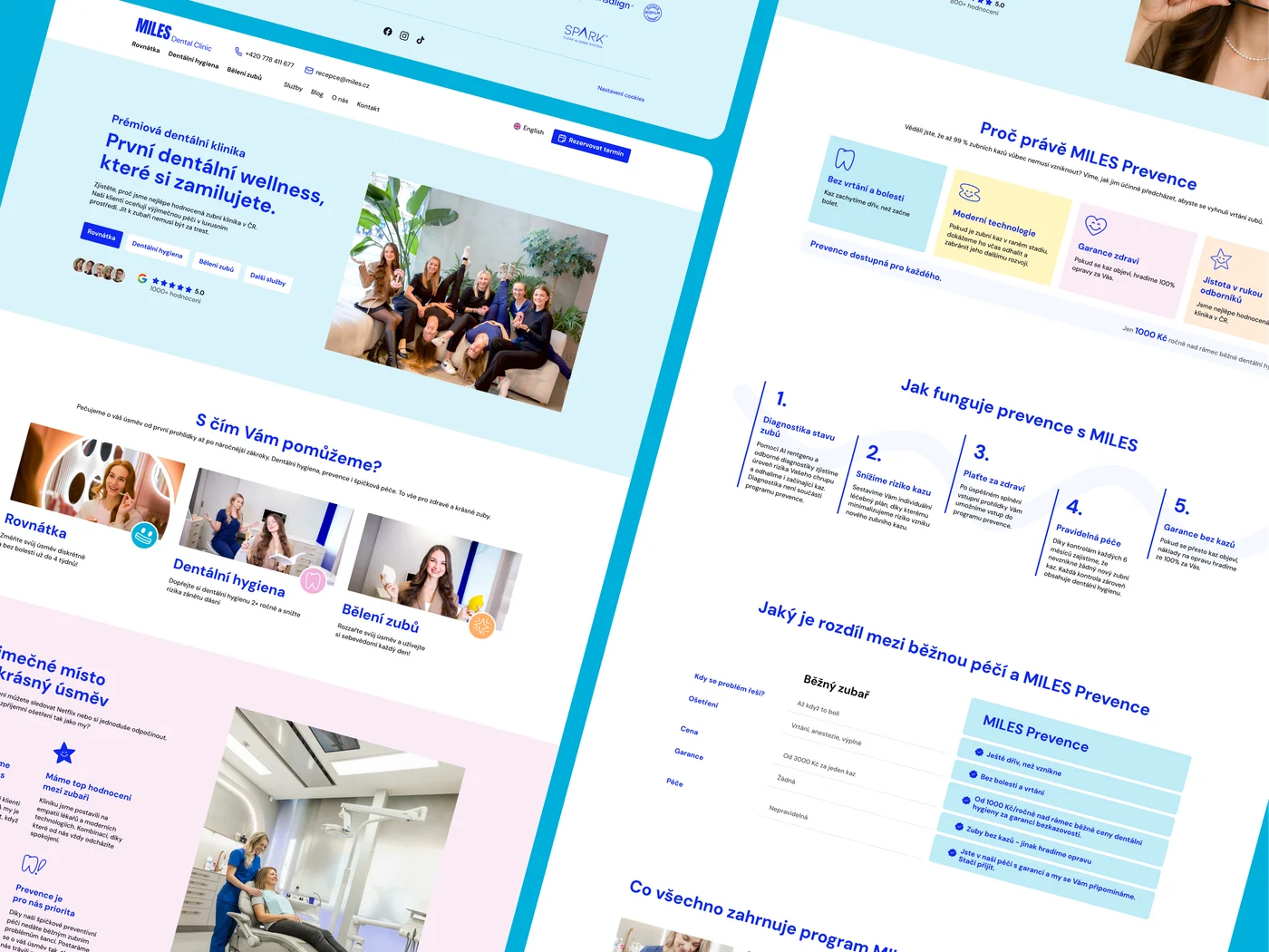
Designing the new website for the prestigious Miles dental clinic was a challenge of translating their brand-new brand manual into a fully functional user interface with absolute precision. Achieving a perfect result required intensive cooperation with the client's marketing and product departments. But it wasn't just pure UI/UX design; I seamlessly brought in my long training in traditional drawing and digital illustration. I created a set of dedicated vector illustrations and icons (doodles) that not only visually enliven the interface but above all extend the brand identity and help build a strong, positive emotion in patients that suppresses the fear of the dentist's chair.
Miles · Case studyDesign that converts and builds authority
Building websites for the healthcare and medical sector is a discipline of its own. Whether it was the Brno general practitioner's office Titanium klinika or the innovative Mitogena center focused on infusion therapies and genetic testing, in these fields design is primarily a tool for building absolute authority, professionalism and a sense of safety. A visitor dealing with their health needs to find relevant information instantly and be able to book an appointment without any frustration. Cleanliness of execution, full accessibility and strategic placement of elements play a critical role in successful conversion.
Yet whether I'm designing a website for an advanced clinic or corporate presentation pages for a technology platform like Olive online, technical and visual precision remains my standard. I make sure the design is perfectly prepared for smooth developer implementation. From subtle micro-interactions to flawless adaptation for mobile devices, I see the final website as one cohesive product, polished down to the last detail, that confidently represents the client's brand.